Can you imagine the total number of mobile users accessing the Internet? No? It is over 56%! In such a market, ensuring a mobile-first web development approach isn’t a luxury but an absolute necessity. A responsive checker is one of the most effective tools that you can implement to achieve this goal.
It will help you to retain your mobile users, improve mobile engagement, and meet the standards of mobile search engine optimization. New to responsive checker? Don’t worry! Our article is here for you. Our guide will help you justify the importance of responsive design and go through various tools and techniques for testing mobile usability.
Finally, we’ll also put forward certain best practices which can help you to ensure that your website is built for success on every screen that your end user might be using.
What Is Responsive Design
Before going into all the details of a responsive checker, we must take a step back and understand the basics to have a solid knowledge in this segment. So, let’s begin with what is responsive design? Under its hood, it is the approach of building a website which will ensure that it can adapt to changing devices and screen sizes.
Previously, the testers preferred creating individual softwares for every device and operating system. This was not only a time-consuming process but was also highly resource-intensive. On the other hand, a responsive design website will have flexible layouts, images, and cascading style sheets to ensure that the content automatically scales and reflows based on the screen size. Leveraging professional web app development services can streamline this process, ensuring your site is optimized for adaptability and performance across all platforms.
Media queries are the most important element of responsive design as they can allow the designers and developers to define the breakpoints at which a website’s layout adjusts for an improved user experience. Now, you may ask that why should you bother about responsive design in the first place.
- Apart from the variety of devices that are accessing the Internet, responsive design would also allow your users to have the best usability and readability experience on your application, irrespective of their device choice.
- It will also help to improve the load times by delivering optimized layouts and images that are customized for ultra-wide monitors to smartwatch screens.
- Finally, it will also help you to simplify the maintenance process as you will be maintaining one code base rather than multiple code bases for every dedicated device.
Why Mobile-Friendliness Matters
Not long ago, mobile friendliness was considered a luxury that the developers had the option of either including or excluding. However, with the rapidly changing industry and the mixed global traffic, you must now include mobile-friendliness as one of the crucial parameters of your web development cycle. To further improve our understanding, let us divert our attention towards some of the major factors that further justify this claim:
- Your users will easily bounce from your web app if you do not optimize for their devices. For example, a website which will require pinch to zoom or is difficult to navigate on a small screen will frustrate the users, reducing the conversion rates.
- Most of the modern search engines like Google prefer a mobile-friendly website. This means that if you do not provide this feature with your web application, it will not be efficiently ranked in search results. Google has also recently shifted to mobile-first indexing so that it crawls and indexes the mobile version of your website at the primary stage.
- Modern users expect professionalism and convenience from the brands that they interact with. Therefore, a poorly designed or non-responsive website will undermine your professionalism, making the users feel that you’re behind time.
- Finally, a smooth and easy-to-use mobile experience will encourage the customers to stay on the web app longer. They will also browse more pages and engage with content or products.
Popular Responsive Checker Tools
To ensure the mobile-friendliness of your website, you can use various tools to test it thoroughly. To shed more light over this segment, we have mentioned some of the major tools in this segment:
- Mobile Friendly Test is a free tool from Google that will help you analyze the URL and also report an overall mobile performance. This performance will help you to highlight any mobile usability issues that might be present in the architecture of your application.
- Google Search Console is yet another Google’s native tool that will provide insights into the mobile usability for the entire website. This tool will constantly flag pages that may have touch element sizing problems, content overflow, or other specific issues.
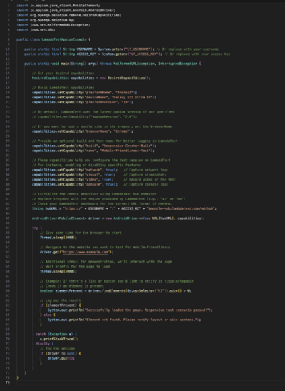
- LambdaTest is an AI-powered test orchestration and execution platform that lets you perform manual and automation testing at scale with over 3000 real devices, browsers, and OS combinations. LambdaTest will also allow you to integrate automation frameworks like Appium to initiate automated mobile-friendly test scenarios. The following code snippet will help you develop a better understanding of this process:

- You can also use Responsinator to enter a URL and see how it renders in different simulated device frames. These frames can include multiple mobile devices like iPhones and even separate Android screen sizes.
- Am I Responsive is yet another tool to quickly display your website in frames that will represent multiple devices like desktops, laptops, and tablets. This tool will also help you to view the performance of your website on multiple devices, like tones and textures at the same time.
- Finally, you can also use the integrated Google Chrome DevTools device mode option to implement device simulation from the browser window itself. Using this feature, you can test various screen sizes without leaving your browser and understand how your application’s performance changes according to these parameters.
In the above list, you must remember that each tool has its separate advantages and use cases. So the best practice will be to understand your requirements and create a list of multiple tools that can serve all your requirements.
Best Practices For Responsive Design
Mobile users will sometimes face changing network speeds and other performance constraints. In such a scenario, it becomes a very daunting task to ensure the proper performance of your app. Below, we have mentioned some of the best practices that can help you in this step:
- You must compress and resize the images on your website for various breakpoints. You can also consider employing lazy loading to delay the loading of off-screen images.
- We suggest the testers to remove repetitive whitespaces and unused code from the application structure. You can also use tools like Webpack or Grunt to automate the minification process.
- CDNs like Cloudflare or Amazon Cloudfront will store copies of your website across multiple global servers. So, by integrating them, you can reduce the latency for users worldwide.
- We also suggest the testers to configure the caching headers to store static assets like images, CSS, and scripts locally on the user’s device for a fixed time.
- You can also consider using an HTML5 srcset for images to serve the correct size based on the user’s device width. It is also useful to consider adaptive bitrate streaming for videos on the web application.
- Finally, you must remember that any extra script like trackers, ads, or social widgets will massively slow down the website loading time. So, you must only use those scripts that are absolutely necessary for the functioning of your application.
Maintaining Responsive Consistency
You cannot wrap up your efforts by only building the mobile-friendly app. This is because your website will evolve with time to add new features or remove the older ones. In such a scenario, it becomes a very important task to ensure the consistency of the layout is maintained throughout:
- You must implement version control and branch testing when adding new features. This will help you to ensure that all the new additions do not break the responsive layout of the application.
- You could consider using continuous integration pipelines, including visual regression tests, as they can help you flag layout issues that will be introduced by the code changes.
- We suggest the testers to perform regular audits with tools like Google MobileFriendlyTest or other services so that they can find the issues at the earlier phases of the development cycle.
- With the growing structure of your website, you must maintain an organized CSS architecture by using methodologies like BEM or SMACSS. This approach will help you avoid style conflicts.
- Finally, you must encourage your end users to report any mobile usability issues. By using on-ground feedback, you can easily catch real-world scenarios that you might not anticipate or miss during the testing process.
The Future Of Mobile Website Testing
Responsive design will continue to adapt itself with all the emerging technologies and user expectations. To share more light over this segment, we have mentioned some of the most important trends that will be coming in this segment:
- As new devices continue to appear, including VR and in-car displays, designing your websites for more diverse screens will become an important part of the testing cycle.
- Progressive web apps will help you eliminate the barriers between websites and native applications. By implementing responsive design principles with these apps, you can provide better offline capabilities and push notifications within your applications.
- Machine learning tools will start to have more control over the application development and testing practices. This trend will give rise to various AI testing tools which will be able to identify layout or performance issues within the site design and compare it with known best results.
- Voice assistants have been gaining a lot of popularity. So, the content will need to be structured and tagged to be accessible through voice. This approach will be moving beyond the traditional visual responsive design practices.
- Finally, various tools like React View or Angular will come as a built-in or third-party library for responsive design testing. This will not only help simplify the entire process but will also help automate the entire structure.
The Bottom Line
Based on all the factors that we have put forward in this article, we can safely say that you must create a mobile-friendly website to maintain your company’s position in the upcoming industry. Moreover, to achieve this goal, a responsive checker will have a crucial role as it will ensure that you are implementing all the aspects of a mobile-first development approach.
By following all the guidelines and embracing a culture of ongoing testing and improvement, you can ensure that your website remains accessible, engaging, and relevant in a world where mobile devices will continue to dominate. Your final goal will be to create websites that can adapt to every screen size and serve the best experience to your customers.


